8 Ways fluid typography can improve your website
Fluid typography is the practice of using flexible design elements to create a seamless reading experience across different devices. It can be used for things like adjusting line-height, width, and weight in order to make the content fit neatly on any device. This article goes over 8 ways that you can use fluid typography principles to improve your website.
What is Fluid Typography
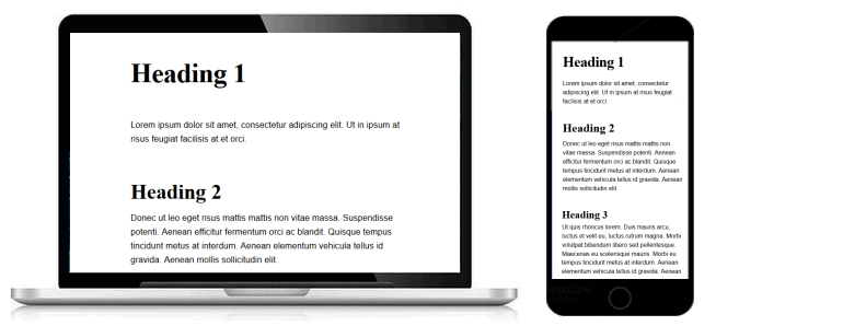
The use of proportionate spacing in a design to give a website a better reading experience. Fluid typography will adjust to the size of your screen so you don’t have to scroll up and down while reading or find yourself with too much or too little content on the screen. Fluid typography is defined as the most recent type of Web layout.
This means that the designer is no longer restricted to a fixed width and can resize their text and images to fit the browser, regardless of its dimensions. The result, for viewers, is an optimal viewing experience that doesn’t require scrolling or zooming in or out. Fluid typography also allows for more creativity in your designs because designers are no longer limited by having to adhere to a specific ratio of font size versus page length.
Principles of Fluid Typography
The goal of fluid typography is to allow text to be responsive and flexible. The spacing should adjust dynamically so that it fits the dimensions of the web browser. The other important principle of fluid typography is to avoid lines breaking or hyphenation. Text should always flow, even if there are line breaks in the code. One of the main principles of fluid typography is Kerning.
This refers to the distance between two letters, and it’s a way of achieving a more natural looking text. Even if your website has a fixed width, you can still use kerning to give your typeface some more variety and style. Another principle of fluid typography is tracking. Tracking refers to the space between words, and it can be used as an additional element of design even on websites with a fixed width size, such as paragraphs that are too long to fit on one line on your screen.
Pros and Cons of Fluid Typography
Achieving fluid typography is tricky. You’ll need to plan for content that might not fit on the screen and design your layouts with the intention of scrolling. The pros are that it offers more usable space, encourages reading, and allows you to accommodate multiple screen sizes by using media queries.
The cons are that it can be hard for users who are new to scrolling, it can lead to messy layouts, and it doesn’t allow for pixel-perfect alignment. One of the benefits of fluid typography is that it works well with any size screen, making it easier to read your content. However, there are some downsides as well. For example, if you want to align text in a way that doesn’t work with the grid you created, you may need to make compromises on other elements on your page.
How to implement fluid typography?
You can implement fluid typesetting by setting a percentage width for your body copy. Setting a percentage width will cause the font size to adjust relative to the screen’s width. This way, if a user is on a mobile phone, their text will be much larger than someone who is using a desktop computer. You can then set any other elements that need to stay fixed in size, such as headers and footers, with pixel sizes for crisp edges.
Fluid typography is a type of web design where the text wraps around the container in order to make it responsive on any device. The wrapping ratio is based off the width of one letter multiplied by the width of the container’s width. For example, if your wrapper’s pixel width is 600px wide and your font size is 16px, then your wrap’s pixel width will be 96px. If you want to get more complicated, you can use percentage values for calculations!
Designing for mobile devices
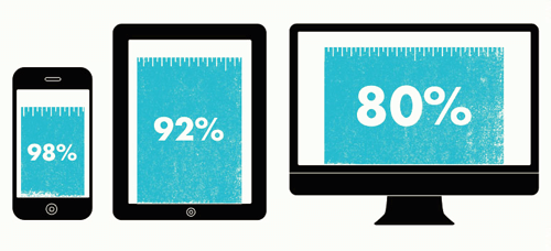
Designing for mobile devices is not only a task of how your site looks on different screen sizes. You have to take into consideration the context where it will be used, the user expectations, and the limitations imposed by some mobile browsers. If you’re just starting out with it, you should still design for mobile devices. The first way to do this is to simply size your text so that it fits the screen.
You can also use relative units so that your content scales up or down depending on how much space is available. These days, most people are accessing the internet on their phones or tablets. This means that you’ll have to design your website in a way that’s easy to read on these small screens. A common solution for this problem is using “fluid typography” – adjusting the text size so it will show up the same way no matter what size screen you’re viewing it on.
Conclusion
Fluid typography is a web design technique that lets you resize your browser window and still have the text resize responsively. It’s one of the simplest and easiest ways to improve your website and offer a better user experience. We hope that this article has given you some new ideas to implement into your website. Have you already implemented any of these features? Let us know in the comments below.