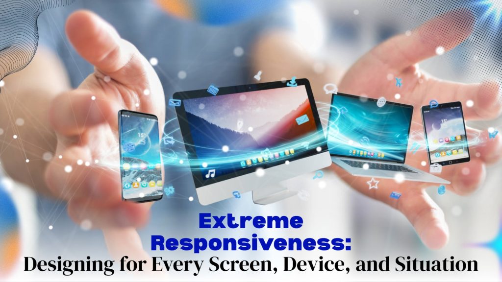
As screens continue to evolve in size, shape, and functionality, the need for extreme responsiveness in web design has never been more vital. Entering Responsive Design 2026, users expect seamless experiences that adapt flawlessly to their devices and environments. Gone are the days of simply resizing content — it’s time to push boundaries and rethink how we design for flexibility and precision. This blog post explores the latest trends, techniques, and best practices redefining responsive web design. Get ready to step into a future where every pixel truly counts!
Overview of Responsive Design 2026
Responsive design in 2026 has evolved beyond basic adaptability. It now embraces a philosophy of extreme responsiveness, ensuring optimal experiences across every device and screen size. Users expect seamless interactions, whether they’re on a smartphone, tablet, or large monitor.
Designers are utilizing advanced techniques to create layouts that fluidly adjust to user contexts. This shift focuses not just on flexibility but also on performance and accessibility, catering to diverse environments and enhancing overall engagement.
The Evolution of Responsive Design 2026
Responsive design has come a long way since its inception. Initially, websites were designed for fixed resolutions, leading to frustrating experiences on various devices. As mobile usage surged, the demand for adaptable designs grew.
Early solutions included simple fluid layouts that adjusted widths proportionally. However, as technology advanced, developers began implementing media queries and flexible grids to enhance usability across screens of all sizes. This evolution laid the groundwork for today’s sophisticated responsive web design practices.
Historical Context: Fixed to Fluid
The transition from fixed layouts to fluid designs marked a significant shift in web development. Early websites were rigid, often looking awkward on varying screen sizes. This inflexibility limited user experience and accessibility.
As technology advanced, designers recognized the need for adaptability. Fluid grids emerged, allowing content to resize dynamically with different devices. This change laid the foundation for today’s responsive design practices, creating a more seamless browsing experience across all platforms and screens.
Marcotte Revolution
The Marcotte Revolution marked a turning point in web design history. Ethan Marcotte introduced the concept of responsive web design in 2010, changing how designers approached layout and user experience. His groundbreaking ideas emphasized fluid grids, flexible images, and media queries.
This shift allowed websites to adapt seamlessly across devices, setting the stage for mobile-friendly designs. As more users accessed content on various screens, Marcotte’s vision became essential for successful online experiences that prioritize accessibility and usability.
Current Mobile-Dominated Landscape
The mobile-dominated landscape has reshaped how websites are designed and experienced. With over half of global web traffic coming from mobile devices, prioritizing mobile responsiveness is no longer optional—it’s essential.
Users expect seamless interactions on various screen sizes, whether they’re browsing on a smartphone or tablet. This shift demands that designers create fluid layouts that adapt effortlessly to any device, ensuring an optimal experience for all users in our increasingly mobile world.
Fundamentals of Web Development for Responsive Design 2026
Responsive design begins with a mobile-first approach. Prioritize the user experience across all devices by designing for smaller screens first. This ensures that essential content is accessible without clutter.
Utilizing flexible grid layouts is key to adaptability. CSS media queries allow developers to adjust styles based on screen size, ensuring optimal viewing. Combining these strategies creates websites that seamlessly fit various resolutions, enhancing usability and engagement for every visitor.
Advanced Responsive Design Techniques
Advanced responsive design techniques are transforming how we approach web development. With tools like CSS Grid and Flexbox, designers can create intricate layouts that adapt seamlessly across devices.
Additionally, integrating container queries allows developers to build more context-aware designs. This means elements adjust based on the parent container’s size instead of just the viewport, enhancing user experience significantly. Embracing these techniques pushes boundaries in taking responsive web design to new limits while ensuring optimal performance everywhere.
Advanced Layout Systems
Advanced layout systems are transforming how we approach responsive web design. With tools like CSS Grid and Flexbox, designers can create intricate layouts that adapt seamlessly to any screen size.
These systems allow for greater flexibility and control over element positioning. As user experiences become more complex, advanced layouts provide the ability to maintain aesthetic appeal while ensuring functionality across devices. This shift is crucial in taking responsive web design to new limits.
Container Queries: The Next Evolution
Container queries represent a groundbreaking shift in responsive design. Unlike traditional media queries that rely on the viewport’s size, container queries allow elements to adapt based on their parent container’s dimensions. This ensures greater flexibility and precision in layout adjustments.
As designers embrace this technique, they can create more modular components that respond dynamically within varying contexts. This evolution paves the way for tailored user experiences across diverse devices and screen sizes, enhancing engagement and usability significantly.
Variable Fonts and Responsive Typography
Variable fonts bring a new level of flexibility to typography. Instead of relying on multiple font files, designers can adjust weight, width, and slant within a single file. This allows for smoother transitions between styles and better control over the visual hierarchy.
Responsive typography adapts seamlessly across devices. As screen sizes change, text scales accordingly without losing readability or aesthetic appeal. This enhances user experience while maintaining brand consistency throughout various platforms.
Technical Evolution: Beyond Simple Responsiveness
The landscape of web design is shifting from basic responsiveness to a more dynamic approach. Users expect websites that not only adapt visually but also function seamlessly across devices. This requires developers to integrate advanced features like adaptive images and smart content loading.
As technology advances, tools like CSS Grid and Flexbox enable intricate layouts that respond fluidly to user interaction. The emphasis is now on crafting experiences tailored for varied contexts, enhancing usability beyond mere aesthetics.
Industry-Specific Considerations
Different industries face unique challenges when implementing responsive design. For e-commerce sites, seamless navigation and fast loading times are critical for conversions. In contrast, educational platforms must prioritize accessibility to ensure all users can engage with the content.
Healthcare websites need to focus on security and privacy while maintaining user-friendly interfaces. Understanding these specific needs allows designers to tailor solutions that enhance functionality across various sectors, ensuring an optimal experience for every audience segment.
SEO and Discoverability
Responsive web design directly influences SEO and discoverability. Search engines prioritize mobile-friendly sites, rewarding them with higher rankings. If a site is not responsive, it risks losing valuable organic traffic.
Moreover, improved user experience leads to lower bounce rates and longer dwell times—both essential for SEO success. By ensuring that content adapts seamlessly across devices, businesses can enhance visibility and reach wider audiences in an increasingly digital landscape.
Cost-Effectiveness and Economic Argument
Investing in responsive web design can significantly boost your bottom line. By creating a single website that adapts across devices, businesses save on development and maintenance costs compared to multiple versions.
Moreover, a well-designed site enhances user experience, leading to higher engagement rates. Satisfied visitors are more likely to convert into customers, making responsive design not just an aesthetic choice but a strategic economic advantage.
Future-Proofing for Tomorrow’s Devices
As technology evolves, so do user expectations. Future-proofing your web design means anticipating trends and integrating flexible elements that can adapt seamlessly to new devices. This approach ensures your website remains relevant as screens grow larger or smaller.
Embracing modular design principles allows for easy updates without a complete overhaul. By using scalable solutions today, you’re not just catering to current devices but also preparing for innovations on the horizon. Stay ahead of the curve and enhance user experiences continuously.
Best Practices and Implementation
Creating a responsive website demands careful planning and execution. Start by using flexible grids and layouts that adapt seamlessly to various screen sizes. Test your designs on multiple devices to ensure optimal performance everywhere.
Utilizing mobile-first design principles can also enhance user experience. Prioritize essential content for smaller screens before expanding features for larger displays. This strategy ensures accessibility while maintaining functionality across platforms, ultimately leading to a more engaging and effective website presence.
Building a Responsive Website in 2026
In 2026, building a responsive website requires a deep understanding of user behavior and preferences. Start by prioritizing mobile-first design. This approach ensures seamless navigation across devices, from smartphones to large screens.
Integrate flexible grids and fluid images for optimal adaptability. Utilize CSS Grid and Flexbox to create sophisticated layouts that respond dynamically to various screen sizes. Testing on real-world devices is essential for achieving the best user experience possible in our multi-device world.
Common Misconceptions in Responsive Design
Many believe that responsive design is just about making sites look good on mobile. In reality, it’s a comprehensive strategy that ensures usability across all devices and screen sizes.
Another misconception is the idea that once a site is responsive, no further updates are necessary. The truth is, as technology evolves, so must your designs. Regular adjustments keep pace with new trends and user expectations for optimal performance everywhere.
Implementation Best Practices for 2026
To implement responsive web design effectively in 2026, ensure that your website is mobile-first. Start by optimizing for smaller screens before scaling up for larger devices. This approach guarantees a seamless experience across all platforms.
Utilize flexible grids and fluid images to adapt layouts dynamically. Regularly test on various devices and resolutions, considering emerging technologies like voice interfaces and wearables. Staying adaptable will keep your designs relevant as user preferences evolve rapidly.
Looking Ahead
As technology continues to advance, the definition of “responsive” will evolve. Designers must stay agile and adapt to emerging trends. The focus will shift towards creating experiences that are not just responsive but also intuitive.
The future may hold innovations like AI-driven layouts or immersive interfaces tailored for unique user contexts. It’s essential to embrace these changes, ensuring designs meet diverse needs while remaining accessible across all devices and platforms.
The Evolving Definition of “Responsive”
The definition of “responsive” is shifting. It’s not just about adapting layouts anymore; it’s about creating immersive experiences across diverse devices and contexts. Users expect seamless interactions whether they’re on a smartphone, tablet, or desktop.
This evolution demands designers to think beyond conventional boundaries. Responsiveness now encompasses performance, accessibility, and user engagement in real-time. As technology advances, so must our understanding of what it means to be truly responsive in web design today.
The Road Ahead: Responsive Design’s Continued Evolution
As technology advances, responsive design will adopt even more sophisticated methodologies. The integration of AI and machine learning will personalize user experiences across devices. We can expect interfaces to adapt seamlessly based on individual preferences.
Moreover, the rise of augmented reality may push boundaries further. Designers must consider multi-sensory interactions that respond not just visually but also through touch and sound. This evolution promises a richer online experience for users everywhere.
Conclusion
Extreme responsiveness is vital in today’s digital landscape. As devices continue to diversify, the need for adaptable designs becomes increasingly important.
Embracing innovative techniques and practices ensures a seamless experience across all platforms. The future belongs to those who prioritize flexibility and user-centric design in every aspect of their online presence.
Responsive design 2026 has transformed how we create and interact with digital content. It’s essential for ensuring accessibility across devices, from phones to tablets and desktop computers.
Today, designing with extreme responsiveness means considering diverse user environments and advanced technologies. Adopting practices like fluid grids and variable fonts enhances user experience while future-proofing websites against ongoing technological advancements. Embracing these strategies is key to staying relevant in an ever-evolving landscape.
Extreme responsiveness is crucial in today’s digital landscape. With users accessing websites across a myriad of devices, seamless experiences are essential for engagement and retention. A site that adapts fluidly to screen sizes enhances usability.
Moreover, extreme responsiveness boosts SEO performance. Search engines prioritize mobile-friendly designs, improving visibility and driving traffic. By embracing this approach, businesses can stay competitive while meeting the diverse needs of their audience effectively.
As we look toward the future of web design, embracing extreme responsiveness is essential. Businesses must prioritize designing for every screen, device, and situation to stay competitive.
Take action today: evaluate your current website’s responsiveness and explore advanced techniques that can elevate user experience. Stay ahead by investing in responsive strategies that adapt not only to today’s technology but also anticipate tomorrow’s innovations. Your users deserve a seamless experience on any platform they choose—make it happen now!