For many internet users, the early web was anything but polished. Websites loaded slowly, navigation menus were sometimes confusing, animated GIFs were everywhere, and a page could look completely different depending on the browser. Yet, decades later, elements of that era are finding their way back into modern websites. This revival is often described through retro web design, a style inspired by the visual language of early websites, desktop interfaces, arcade games, pixel graphics, and Y2K culture. In 2026, designers are taking these familiar visual cues and combining them with modern technology, responsive layouts, accessibility standards, and sophisticated user experience principles.
The result is not simply a return to old websites. It is a reinterpretation of internet nostalgia for a new generation.
What Is Retro Web Design?
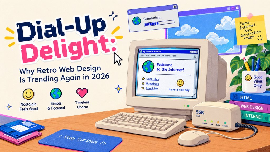
Retro web design draws inspiration from earlier periods of digital culture. Depending on the creative direction, it may reference the internet of the 1990s, early-2000s websites, classic operating systems, gaming interfaces, or Y2K aesthetics.
Common characteristics include:
- Pixel-inspired graphics
- Bright or unconventional color combinations
- Chunky typography
- Textured backgrounds
- Skeuomorphic elements
- Old-school buttons and interface panels
- Animated icons
- Marquee-style text
- Computer-window layouts
- Pixel art and low-resolution illustrations
- Nostalgic loading screens
- Retro cursor effects
- Early-internet-inspired navigation
However, modern retro design does not need to reproduce every visual limitation of the past. Instead, designers selectively borrow recognizable elements while maintaining contemporary usability.
Why Is Retro Design Trending Again in 2026?
One major reason is digital saturation. Modern websites often follow similar design patterns: generous whitespace, neutral color palettes, minimalist typography, rounded cards, subtle shadows, and predictable navigation. These conventions can create clean experiences, but they can also make different brands feel visually similar.
Retro design provides an alternative. A website inspired by the early internet can immediately communicate personality. Instead of blending into a sea of polished interfaces, it can create a visual identity that visitors remember.
There is also a growing appreciation for nostalgia across digital culture. Younger audiences who did not experience the early web firsthand can discover its visual language through games, social media, music, fashion, memes, and contemporary creative work. For older audiences, these elements can trigger memories of their first experiences online. That combination makes retro aesthetics unusually flexible.
Key Elements of Retro Web Design
Retro web design draws inspiration from past styles, creating a distinctive charm. Bold colors and vibrant patterns often take center stage. Think neon greens, bright pinks, and electric blues that evoke the playful spirit of earlier internet days.
Typography is another critical element. Classic fonts like Comic Sans or pixelated typefaces remind users of simpler times. These choices create an immediate sense of nostalgia.
Graphics also play a significant role. Low-resolution images and GIFs showcase an era when bandwidth was limited but creativity thrived. Animated elements capture attention while adding whimsy to websites.
Navigation tends to be straightforward yet quirky—think oversized buttons and simple layouts that guide visitors without overwhelming them.
By combining these key components, retro web design offers not just functionality but also a delightful trip down memory lane for those who remember the early days of the internet.
The Benefits of Using Retro Design for Websites
Retro design brings a sense of nostalgia that resonates with many users. It taps into fond memories, creating an emotional connection. This can lead to increased engagement and time spent on the site.
Visually, retro elements stand out in a sea of modern minimalism. Bold colors and quirky fonts capture attention fast. They make websites memorable and unique, helping brands carve their identity.
Additionally, retro web design often embraces simplicity. Fewer distractions mean better user experience. Visitors can easily find what they need without overwhelming clutter.
Furthermore, retro aesthetics provide versatility across various industries—from fashion to tech. They evoke different eras’ vibes while appealing to diverse audiences.
Using these designs also fosters creativity among developers and designers alike. It invites experimentation while honoring the past’s charm in fresh ways that appeal today’s users.
How to Incorporate Retro Elements into Modern Websites
Incorporating retro elements into modern websites is all about balance. Start by selecting a nostalgic color palette that evokes the Y2K era, like pastel hues or bold neons. This instantly sets the tone.
Typography plays a crucial role in retro design. Choose playful fonts reminiscent of old-school arcade games or classic 90s pop culture for headings and calls to action.
Images are another way to channel nostalgia. Use pixel art graphics or vintage illustrations to give your site an authentic feel while keeping modern functionality intact.
Don’t forget textures! Incorporate grainy backgrounds or patterned overlays that harken back to early internet aesthetics without overwhelming the user experience.
Consider adding interactive elements such as GIFs and animations inspired by retro web designs. They can engage visitors while providing a fun nod to the past, enhancing overall engagement on your site.
Potential Challenges and Limitations of Retro Web Design
Retro web design, while charming, isn’t without its hurdles. One major challenge is the balance between nostalgia and usability. Users today expect seamless navigation and fast load times. If a site leans too heavily into old-school aesthetics, it can frustrate visitors.
Another limitation lies in responsiveness. Many retro designs were not created with mobile devices in mind. In an era where users browse on various screens, failing to adapt could alienate a significant portion of your audience.
Additionally, search engine optimization becomes trickier with outdated elements that may hinder performance metrics. An appealing design must also align with modern SEO practices to maintain visibility.
There’s always the risk of being perceived as gimmicky or out-of-touch if the retro theme isn’t executed thoughtfully. Striking the right chord is crucial for success in this revival trend.
Is Retro Web Design Right for Every Brand?
No single design trend works for every business. Retro design may be particularly suitable for creative studios, entertainment brands, gaming companies, cultural projects, personal portfolios, fashion brands, media platforms, and businesses whose identity benefits from playfulness or nostalgia.
For highly regulated, highly technical, or traditionally corporate organizations, a completely retro interface may require more careful consideration. That does not mean retro elements cannot be used.
A subtle approach may work better: nostalgic typography, custom illustrations, vintage-inspired icons, or a retro visual campaign within an otherwise conventional website.
The Future of Retro Web Design
The renewed interest in retro design does not necessarily mean modern web design is moving backward. Instead, it reflects a broader shift toward individuality. Designers are increasingly combining different eras, technologies, and visual languages. A website can have a minimalist structure, Y2K graphics, AI-powered functionality, immersive animation, and retro-inspired typography all within the same experience. This hybrid approach is likely to keep evolving. The most interesting websites may not belong completely to one design trend. They may borrow familiar ideas and reinterpret them in unexpected ways. That is where Dial-Up Delight becomes more than a nostalgic reference. It represents the idea of taking something familiar from the early web and giving it a new purpose.
Conclusion: Embracing the Nostalgia Factor in Website Design
Embracing the nostalgia factor in website design opens a treasure chest of creativity and connection. As we navigate through 2026, the allure of Y2K web design and its striking aesthetics continue to resonate with users seeking comfort in familiarity. Retro web design, characterized by vibrant colors, quirky fonts, and playful layouts, speaks to our collective memories.
Designers are now blending these retro elements harmoniously into modern frameworks. This synergy creates websites that feel both nostalgic and fresh—a delightful combination that captivates audiences. The rise of Dial-Up Delight is evident; it invites visitors not just to browse but to relive moments from an era gone by.
While challenges exist—like balancing usability with aesthetic appeal—the rewards often outweigh them. Nostalgia fosters emotional connections that can enhance user loyalty and engagement, making retro designs more than just a trend; they become an experience.
As we look ahead, it’s exciting to anticipate how this movement will evolve further. Will new technologies amplify retro vibes? Only time will tell. What’s certain is that as long as people cherish memories from their pasts, dial-up inspired designs will continue weaving their way into the digital landscape—creating spaces where old meets new in delightful ways.