When it comes to modern web design, visual elements like sliders and banners play a crucial role in shaping user experience and guiding visitor behavior. From eye-catching homepage banners to dynamic sliders that showcase multiple messages in one space, these elements can influence how users interact with your website—and whether they stay or leave.
Used strategically, sliders and category banners can improve navigation, highlight key offerings, and even drive conversions. Formats like masonry grid banners are also gaining popularity for their ability to present diverse content in a visually engaging layout. Meanwhile, website sliders (or carousels) offer a compact way to display images, videos, or promotional content without overwhelming the page.
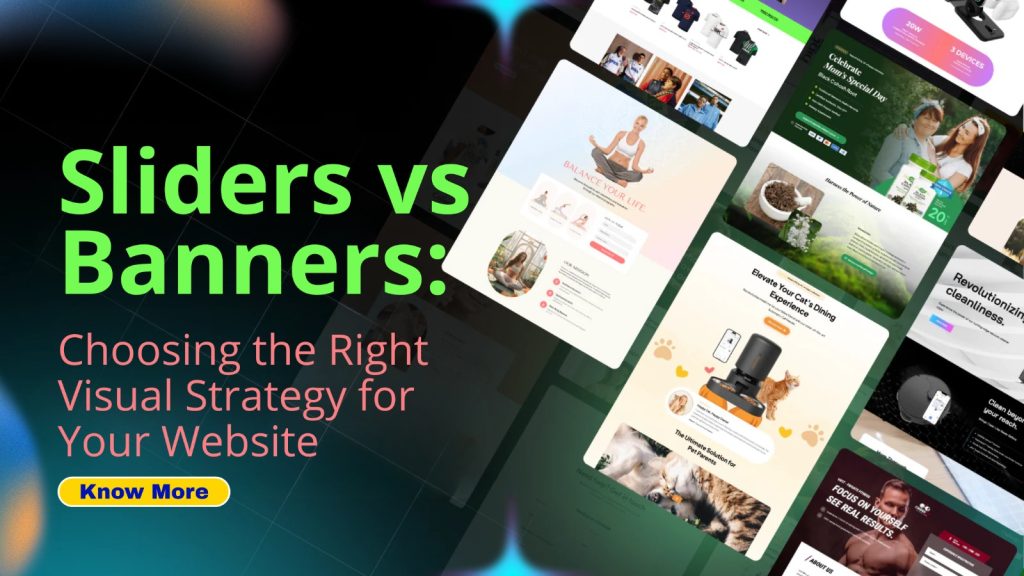
But here’s the catch: not every website benefits equally from both. Choosing between sliders and banners isn’t just a design decision—it’s a strategic one that can impact your SEO performance, user engagement, and sales. In this guide, we’ll break down the differences and help you decide which visual approach works best for your website.
What are Sliders and Banners?
Sliders and banners are both popular visual elements used on websites to enhance user engagement.
A slider typically features a series of rotating images or content panels. It allows users to view multiple pieces of information without overwhelming the screen with too much text or imagery at once. Each slide can highlight different products, services, or promotions.
Banners, on the other hand, are often static visuals that occupy a designated space on the page. They can be designed as advertisements or informative graphics and usually convey direct messages clearly and concisely.
While sliders create dynamic experiences for visitors, banners deliver straightforward communication effectively. Both have their distinct purposes in web design and serve varied marketing strategies within digital landscapes.
Pros and Cons of Using Sliders
Sliders can be a visually striking addition to your website. They grab attention and allow for the display of multiple messages or images in one space. This dynamic presentation keeps users engaged, especially when content is vibrant and well-designed.
However, sliders come with their drawbacks. Many users find them distracting, often leading to frustration if they can’t read the information before it changes. Additionally, sliders can slow down page load times, impacting overall user experience.
Accessibility is another concern; some visitors may struggle with automatic transitions that move too quickly. Balancing effectiveness with usability becomes crucial when integrating sliders into your design strategy.
While sliders offer an appealing format for showcasing content, careful consideration is necessary to ensure they enhance rather than detract from the user journey on your site.
Pros and Cons of Using Banners
Banners can be eye-catching and effective for conveying key messages. They allow you to showcase a single, impactful image or message that captures visitors’ attention immediately.
One significant advantage of banners is their simplicity. Users don’t have to wait for slides to change, making it easier for them to absorb the information quickly.
However, there are downsides. Banners can easily become overlooked if they blend into the website’s design. If not strategically placed, they may fail to capture attention.
Additionally, there’s a risk of oversaturation with banner ads across various sites. This can lead users to tune them out entirely.
Banners typically convey only one piece of content at a time. This limitation means less flexibility in communicating multiple offers or messages simultaneously compared to sliders.
Factors to Consider When Choosing Between Sliders and Banners
Choosing between sliders and banners isn’t just about aesthetics. It’s essential to consider your website’s primary goal. Are you aiming for immediate engagement or conveying multiple messages?
User experience plays a crucial role as well. Sliders can be distracting if not designed thoughtfully, while banners typically provide clarity at a glance.
Loading speed is another factor to weigh. Sliders often take longer to load due to animations and multiple images, potentially frustrating visitors on slower connections.
Don’t forget about mobile responsiveness. Banners typically adapt better across devices, ensuring that your message remains visible without compromising user experience.
Think about analytics. You need a clear way to measure the effectiveness of either option in driving conversions or clicks. Data-driven decisions will guide you toward the right choice for your audience and objectives.
Examples of Successful Slider and Banner Implementations
When you think about successful slider implementations, a few standout examples come to mind. The Airbnb homepage effectively uses sliders to showcase stunning images of destinations. This approach draws users in and sparks their wanderlust.
On the other hand, banners can also shine brightly. A great example is Dropbox’s landing page banner that highlights its key features succinctly. The clean design prioritizes user experience while delivering essential information at a glance.
E-commerce sites often favor both strategies for different purposes. For instance, ASOS combines sliders for seasonal promotions with banners announcing sales or discounts prominently on the same page.
These approaches show how diverse visual strategies can enhance engagement and drive conversions across various industries. Each method serves unique goals depending on brand identity and user intent, making it crucial to choose wisely based on specific needs.
Tips for Designing Effective Sliders and Banners
When designing effective sliders and banners, clarity is key. Make sure your message is easy to read at a glance. Use bold fonts and high-contrast colors that stand out.
Images should be visually appealing yet relevant. Choose pictures that resonate with your audience and enhance the overall theme of your site.
Keep animations subtle if you choose to include them. Too much movement can distract users rather than engage them. Smooth transitions are often more effective.
Ensure that calls-to-action are clear and compelling. Position buttons prominently so visitors know what action to take next.
Test across different devices before going live. What works on desktop might not translate well to mobile screens, so adaptability matters in design choices for both sliders and banners.
Conclusion
Choosing the right visual strategy for your website can significantly impact user experience and engagement. Sliders and banners each have their own unique advantages and drawbacks. Sliders can grab attention with dynamic content, but they may frustrate users if not designed thoughtfully. Meanwhile, banners offer a straightforward approach that keeps important messages visible without distraction.
When deciding between sliders vs banners, consider factors such as your audience’s preferences, load times, and the specific goals of your site. Both options have been successfully implemented by various brands to enhance aesthetics while delivering key information effectively.
It is essential to align your visual strategy with the overall goals of your website. Careful consideration will help you create an engaging environment where visitors feel informed and inspired to interact further with your content. By understanding both sliders and banners thoroughly, you’ll be equipped to make an informed decision that drives success for your online presence.