Have you ever visited a website on your phone, only to feel frustrated and leave within seconds? You’re not alone. In today’s fast-paced digital world, mobile users are more demanding than ever. They expect websites to load quickly, be easy to navigate, and provide relevant content right at their fingertips. But what happens when your beautifully designed site isn’t performing well on mobile devices? You may find that despite its aesthetic appeal, visitors are bouncing away faster than you can say “mobile optimization.” This blog post dives into why mobile performance matters for keeping customers engaged and ensuring they stick around long enough to convert. Let’s uncover the reasons behind high bounce rates among mobile users and discover actionable tips for optimizing your site effectively!
The Importance of Mobile Optimization
Mobile optimization isn’t just a nice-to-have anymore—it’s something you really need. More than half of all people using the internet do it on their phones, so your website has to work well on mobile devices. If you ignore mobile users, you’re probably missing out on customers who like to shop or look things up on their phones.
A website that’s set up for mobile makes it easier for people to use. It loads quickly and is simple to navigate. Mobile users are often busy, and if a site is slow or hard to use, they’ll probably leave and not come back.
Search engines like Google also favor websites that work on mobile. If your site is mobile-friendly, it can show up higher in search results, which means more people will find your business online.
In short, making your website work well on mobile helps you stay ahead of the competition. It shows you care about your customers’ time and needs, and it gives them a smooth way to access what you offer.
Understanding The Behavior of Mobile Customers
Mobile customers are different. They want things done quickly and get frustrated if things take too long. With smartphones, they expect smooth and easy experiences right at their fingertips.
They often look for information while moving around, like when they’re on a bus or waiting in line. If a website is slow, they might leave without even looking further.
People using mobile devices have short attention spans. They read quickly, skipping over long paragraphs. That’s why good visuals and easy-to-use menus are important to keep them interested.
They also value simplicity. If the checkout process is too complicated, they might just walk away. Making things simple and clear is essential to keep them on board.
Knowing these things helps create better experiences that fit what mobile users really need and prefer.
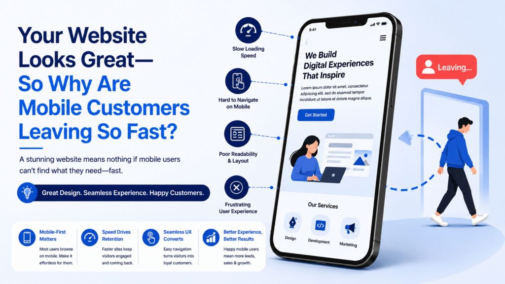
Common Reasons For High Bounce Rates on Mobile Devices
Many mobile users leave a site quickly due to slow loading times. If a page takes too long, impatience sets in and they often move on.
Another common issue is design clutter. A chaotic layout can overwhelm visitors, making it hard for them to find what they need. Clear navigation is essential.
Inadequate content can also drive users away. If the information isn’t relevant or engaging, their interest wanes rapidly.
Pop-ups are notorious for frustrating mobile customers as well. They disrupt the browsing experience and lead many to exit before even exploring your offerings.
Poorly formatted websites may not display correctly on smaller screens. Text that’s too small or images that don’t fit properly create an unpleasant viewing experience, prompting quick exits from potential customers searching for seamless usability.
Tips For Optimizing Your Website For Mobile Users
To enhance mobile optimization, start with responsive design. This approach ensures your website adapts seamlessly to various screen sizes.
Next, minimize loading times. Compress images and reduce unnecessary scripts to keep your site fast. A one-second delay can significantly impact user engagement.
Prioritize easy navigation. Use larger buttons and simplify menus for effortless browsing on smaller screens. Consider thumb-friendly placements for key actions.
Content is crucial; make it concise and scannable. Short paragraphs, bullet points, and clear headings help users absorb information quickly.
Test regularly across devices to catch issues early. Different operating systems may present unique challenges that require attention for optimal mobile performance matters.
The Impact of a User-friendly Mobile Site on Customer Satisfaction and Conversion Rates
A user-friendly mobile site is crucial in today’s digital landscape. When customers find it easy to navigate, they are more likely to stay and explore.
Intuitive design elements enhance the overall experience. Quick loading times keep frustration at bay, allowing users to access information seamlessly.
User satisfaction directly correlates with how well a site performs on mobile devices. If visitors encounter barriers—like confusing layouts or slow responses—they may leave without completing their intended actions.
Effective mobile optimization can significantly boost conversion rates. A streamlined checkout process encourages purchases, while clear calls-to-action guide users toward desired outcomes.
When your website caters specifically to mobile preferences, customer loyalty increases. Happy customers tend to return and recommend services through word-of-mouth or social sharing.
Conclusion: Don’t Neglect Your Mobile Audience!
Mobile optimization isn’t just a passing trend; it’s a key part of making your business succeed. Your website might look great on a desktop, but if it’s not set up for mobile users, you might lose customers who mostly use their phones or tablets.
Today’s mobile users have shorter attention spans and want things done quickly. If they face slow pages, hard-to-use menus, or a website that doesn’t work well on their device, they’re likely to leave without staying longer.
High bounce rates on mobile can happen for several reasons. A confusing checkout process, pop-ups that interrupt the flow, and images that load too slowly can all make the experience frustrating for users.
To make your site better for mobile, focus on speed and making things easy to use. Make sure images are optimized to load quickly and remove any extra code that slows things down. Buttons should be big enough to tap easily, and content should be clear and easy to read without needing lots of scrolling.
A mobile-friendly website leads to happier customers and more sales. People appreciate a smooth, tailored experience that works well on their phones. This can help businesses improve how people engage with their site and increase the number of sales.
Since most online visitors now use mobile devices, making your site work well on these devices should be a top priority, not something you do later. Using the right strategies for mobile optimization can help you keep customers who might otherwise leave because of a poor website experience.